The most important aspect of mobile behavior is to define wraps on mobile.
What does "Wrap on mobile" mean? If you're not sure what wrap in mobile view means, you can find an explanation here.
Step by step
- Open your container in the "Mobile behavior" workflow step.
-
Select all cells that should be moved to the next line in mobile view.
To do this, click on the vertical border where you want to wrap on mobile.
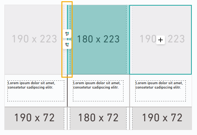
Also select the subsequent cells of the same column with a single click.

Click the
 icon to also wrap the last column.
Only selected cells are wrapped: Make sure that all cells you want to wrap are highlighted in turquoise.
-
Click:
-
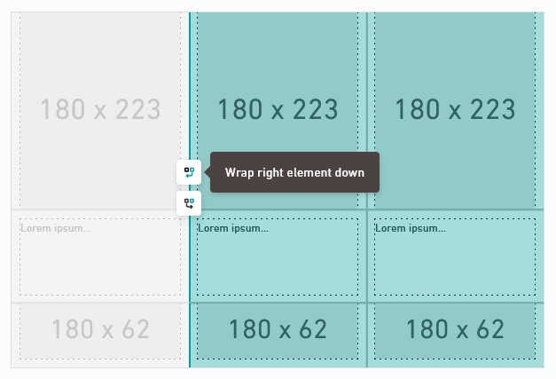
 "Wrap right element down" to display all right, turquoise-colored elements in a new line on mobile view
 -
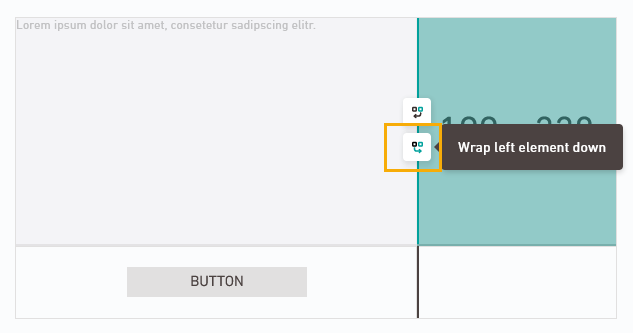
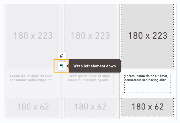
 "Wrap left element down" to display all left elements marked in grey in a new line on mobile view
 What is the difference?
Depending on how your container is set up, it may make more sense to wrap the left or right element down in mobile view. You can see the difference in the output:
Wrap right element down
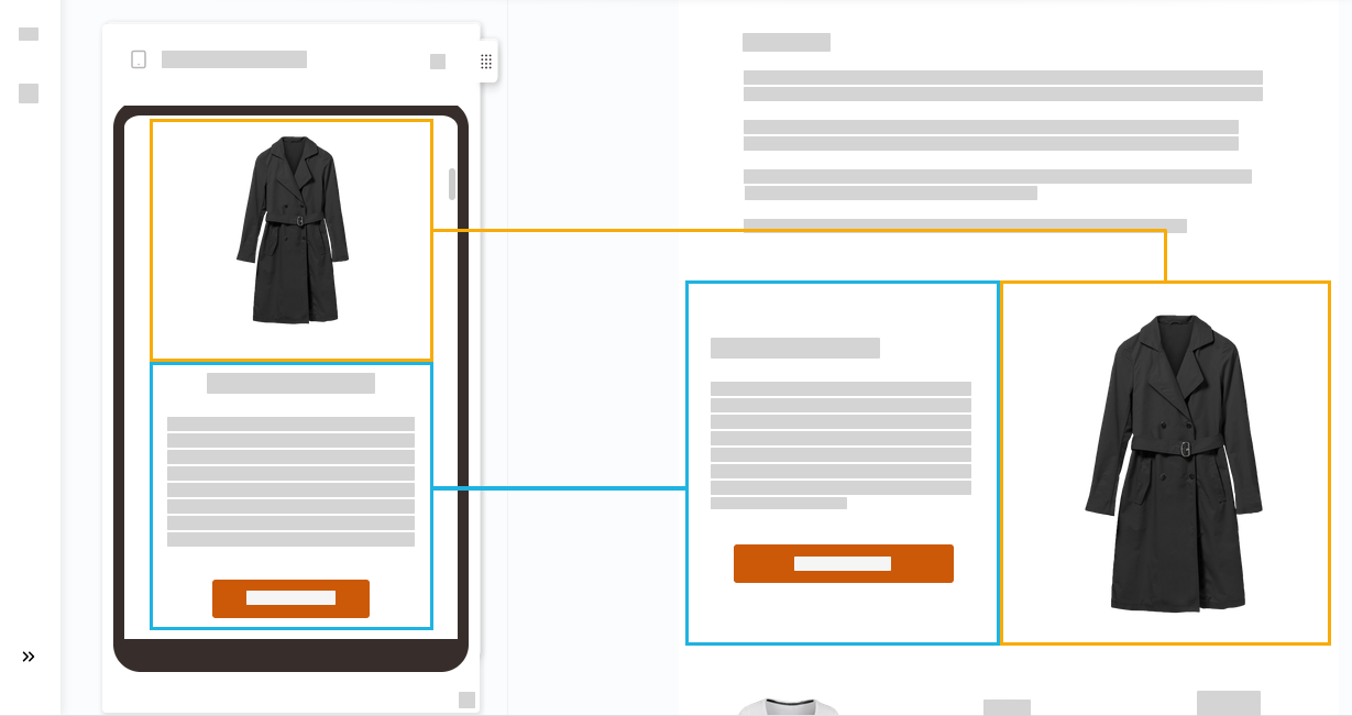
Wrap left element down
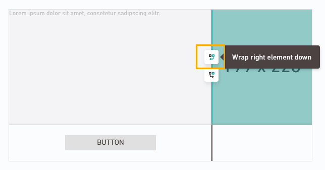
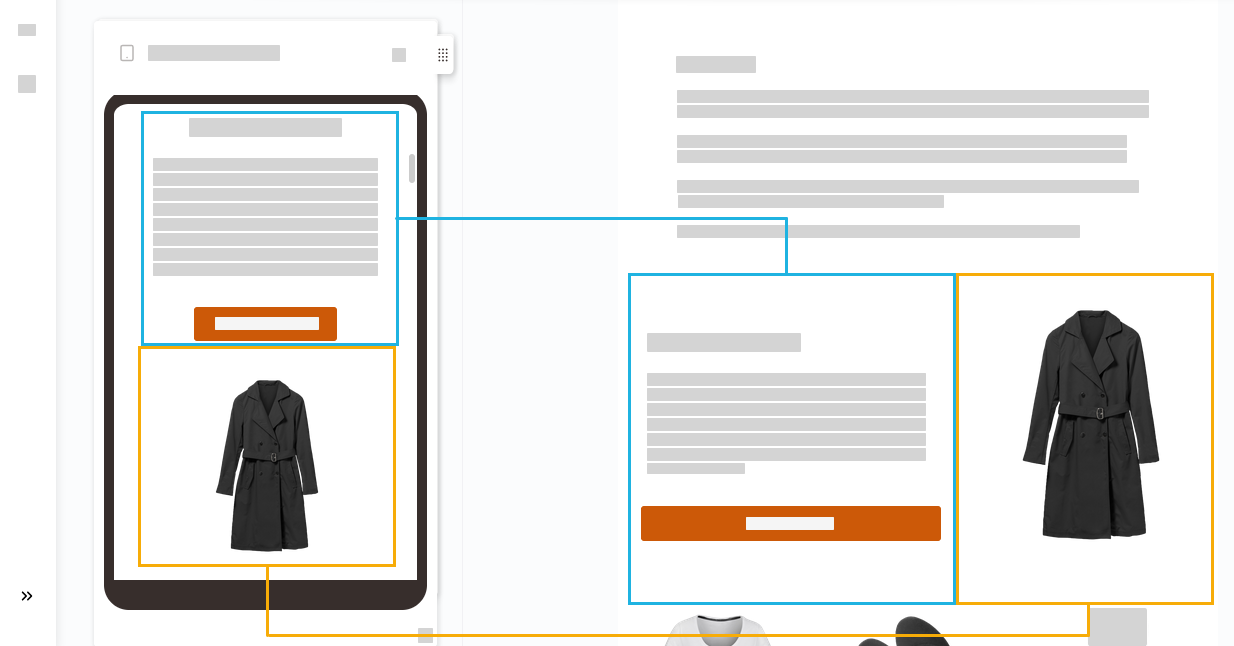
The element that is visible on the right in the desktop view is displayed at the bottom on mobile.
The element that is visible on the left in the desktop view is displayed at the bottom on mobile .
-
-
Check the "Mobile preview" panel to see if your line breaks appear as they should.
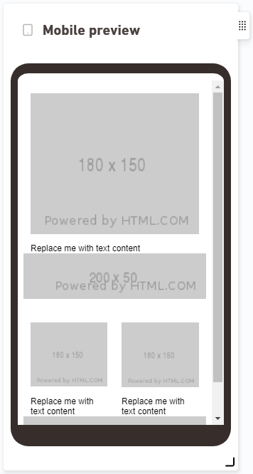
Mobile preview: Before – after
Before After 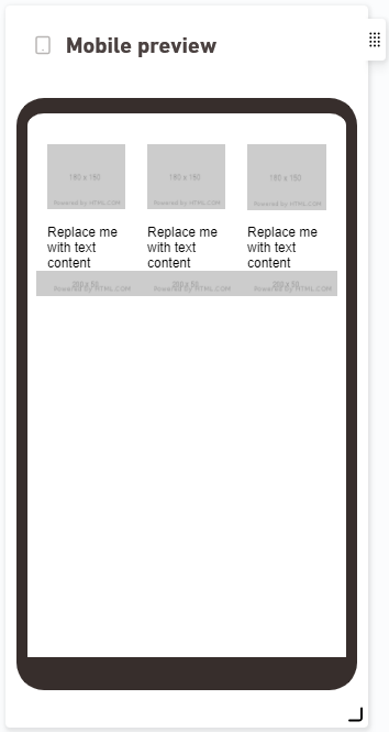
No wrapping = desktop view: All cell groups for which you did not make any settings will remain as they appear in the desktop view and are scaled to fit small screens.
-
Do you accidentally set a line break in the wrong place?
Then click
 "Delete group" to undo the changes.
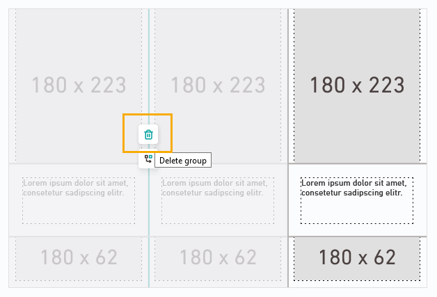
If the grouping was already correct, but you want to correct the order, you can also just click on "Wrap left element down" (or: "Wrap right element down").
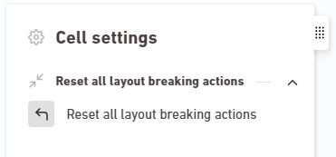
Do you want to start over?
It takes a little practice until you get a hang of how wrapping texts in the mobile view works. Simply click "Reset all line breaks" and start over again if you are not happy with the results the first time.
-
Repeat the procedure for all columns that are to wrap on mobile.

- You have defined the line breaks in the mobile view for your container.
Mobile preview with real images: Do you want to see how your container will wrap in the mobile view when using real images?
Then add your container to a mailing and check the mobile view in the mailing preview.
Next steps
- Hide individual elements on the mobile view. You can also define a different size or position for elements in the mobile settings.
- Add your container to a mailing and fill it with actual images and texts. Go to the mailing preview to check the mobile view containing actual content.
Can’t see your current navigation item?
Check your profile to see the rights you have or get in touch with your account manager.
Did you not find what you were looking for?
-
Send us your feedback.
