 What is mobile behavior?
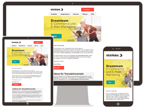
Your mailing is typically displayed in landscape format on a standard, large-sized computer screen. Conversely, portrait format is used on the small screens of smartphones and tablets.
That's why it makes sense to optimize your mailing for the mobile view. It will then be easy to read on all devices.
Standard mobile behavior
By default, your mailing is scaled to fit on small screens. The entire mailing is displayed the same way on a mobile device as it is on a desktop system, just smaller due to the size of the screen. As a result, the texts and images may be squeezed together to fit in the tight space.
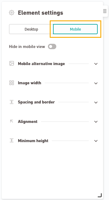
Above all, mobile optimization means that you define breaks for your containers that only work in the mobile view. In the container editor, you can also use a different mobile view. Alternatively, you can specify it in the mailing editor. Use the "Mobile" tab of the "Element settings" panel.
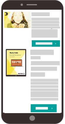
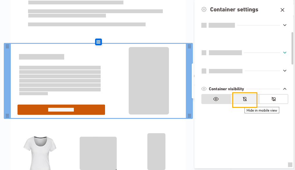
Standard view
(side by side)
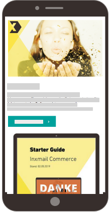
View optimized for mobile devices
(stacked)
You can define the mobile behavior at different levels:
-
In the container editor, you define the mobile breaks and a different mobile layout.
-
In the mailing editor you can overwrite the container settings and adapt them specifically for this one mailing. To do this, use the "Mobile" tab in the "Element Settings" panel.
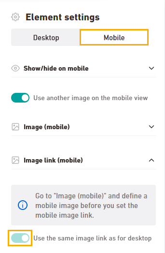
In the "Element settings" you can, for example:
Use a different image on mobile
In the video, you’ll learn how to use a different image for mobile.
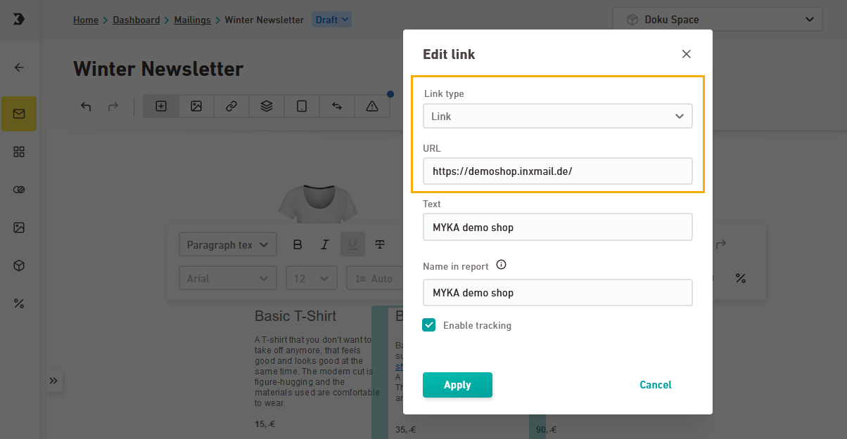
Different mobile link: You can also enter a different mobile link as needed.
Disable the “Use desktop image link” switch to open the link dialog and enter your URL.
-
Use the "Mobile preview" panel, to check which mobile settings are adopted.
Mobile preview: You will see a working version without personalization. If you have personalized your email recipient attributes, check the display in the Preview tab.
Learn more
The mobile preview adapts dynamically when you click on an element in your mailing.
Did you not find what you were looking for?
-
Send us your feedback.
