You configure the text and image sections in the "Layout" workflow step. You also define the spacing and borders and set the alignment of your elements.
Step by step
-
Open your container in the "Layout" workflow step.
-
Drag text, image or button elements from the left panel to your container cells.
You can also leave container cells empty.
-
Cell settings
Define the spacing, borders, and other settings for every container element.
Multiple selection using Ctrl key: Press Ctrl to select and edit several container elements at once.
 Cell settings
Section
Settings you can make:
Spacing and borders
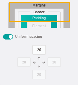
Dynamically switch between:
- Margin
- Padding
-
Border
Scale image size 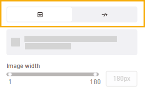
Scale your image elements to the desired size.
Use the full cell width or scale your image freely.
Alignment
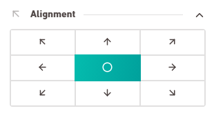
Set the alignment for your container cell. The default setting is top left.
Cell height
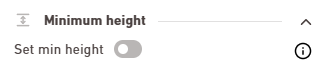
Define a minimum height if you do not want your cell to auto-adjust to the content. -
Placeholder texts
For layout containers, you can replace default placeholder text with your own placeholder text and assign text styles to it.
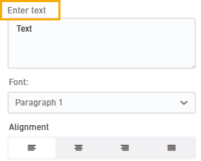 Note: You can only define placeholder text for layout containers here. For content containers, enter the text in the Content workflow step.Which text styles can I use and how do I see the layout effects?
You can select the text styles that are permanently stored in all style sets and cannot be deleted:
-
Continuous text 1 and 2
-
Heading 1, 2 and 3
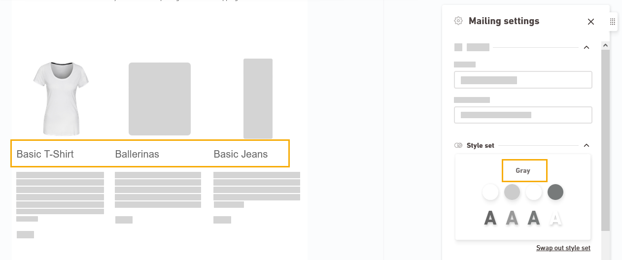
You will see the actual layout only within the mailing. For example, what Heading 1 looks like at the end depends on which styleset is assigned to your mailing.
Display in the mailing
Example 1
Example 2

-
- You have updated your container layout.
Next step
-
For content containers: Edit your container content.
or:
- Define the mobile behavior of your container.
Can’t see your current navigation item?
Check your profile to see the rights you have or get in touch with your account manager.
Did you not find what you were looking for?
-
Send us your feedback.
