Perform Update: Update your Advanced Template Mailing by clicking the Update button.
Version 2025-05 of the Advanced Template is all about accessibility.
Perform update: Activate the functions by clicking the Update button: 
How do I make my mailing accessible or low-barrier?
As we all know, there is no such thing as absolute "accessibility". We would like to give you a few tips on how to make your mailing as accessible as possible for all your recipients.
Many people with visual impairment use screen readers that read out mailing content to them. The following points are key here:
-
Alt text and title: We recommend that you store alternative texts and titles for all your images. This allows recipients with visual impairments to have the text read aloud to them by a screen reader. Bots and search engines also like to access the written image information.
For more information, see: Creating a three- or multi-column article (image)
-
Buttons: It is best to use HTML buttons (= "Button" element), as they are better recognized and read by screen readers. If you use the "Button as image" element, you must enter role="button" in the optional HTML parameters under "Link image to link".
For more information, see: Create a three-column or multi-column article (button)
-
Heading levels: Headings help you structure your mailings. Different heading levels (h1-h6) ensure different weighting of the content within your mailing and help recipients with screen readers to navigate through your mailing and to correctly read your mailing content. This makes your mailing more accessible (low-barrier).
If you want screen readers to be able to recognize and correctly read your headings, you must tag them as headings using HTML.
We also recommend that you style your headline using inline css.
Example:
Copy<h1 style="font-size:20px;text-decoration:none;font-weight:bold;color:#0000ff">Überschrift</h1>For more information, see: Creating a three- or multi-column article (heading)
Possible for all text fields: You can apply HTML and CSS this way for all text fields. This means that you can structure your content and use different heading levels not only in the “Heading” element, but also in the “Text” element.
Technically, we have optimized the Advanced Template as of version 2025-05 so that the table structure of your mailing as well as HTML buttons will be recognized by screen readers. You do not need to take any further action. Just make sure that your mailings are based on the latest Advanced Template.
Further measures:
-
Choose your colors so that the contrasts are sufficient for people with visual impairments to be able to read your text easily.
-
Use sufficiently large font sizes.
-
Write your texts in plain language.
Overview
In version 2024-07 you will find new features, optimizations and bug fixes for the Advanced Template.
Perform update: Activate the functions by clicking the Update button: 
Perform update: Activate the functions by clicking the Update button: 
Settings: Insert preview line at the beginning of the text version
Element: Settings > Insert preview line at the beginning of the text version
Some email clients don't show the preview line unless it is inserted at the beginning of the email's text version. Use the "Insert preview line at the beginning of the text version" element to make sure these email clients will also display your preview line correctly.
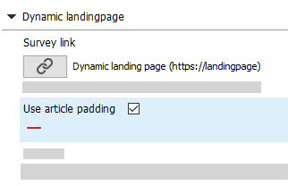
Dynamic landing pages: use article padding
Element: Dynamic landingpage > Use article padding
Note: The Dynamic landing page element is only available in Advanced Template Plus. For information on purchasing and implementing Advanced Template Plus contact your Inxmail contact person or Care-Consulting@inxmail.de.
Use the "Use article padding" element to apply the padding of the surrounding article to your dynamic landing page. This way you avoid that - depending on the design - your landing page texts will be placed too close to your article's margins.
Perform update: Activate the functions by clicking the Update button: 
Multi-column articles
Element: Article (multi-column)
Use the "Article (multi-column)" element to display any number of articles next to each other. You can use different item widths if needed.
In addition to the standard settings, there are several new functions to influence the mobile display for multi-column articles via checkboxes:
-
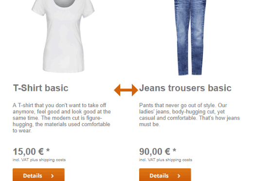
Display multi-column articles side by side in the mobile version
-
Mobile – Scale articles evenly
-
Mobile – Scale incomplete row to full width (only with even scaling)
-
Mobile – Display incomplete row first
-
Mobile – Number of items next to each other (max. 5)
-
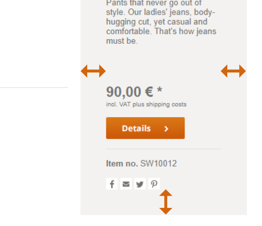
Mobile – Vertical distance between articles
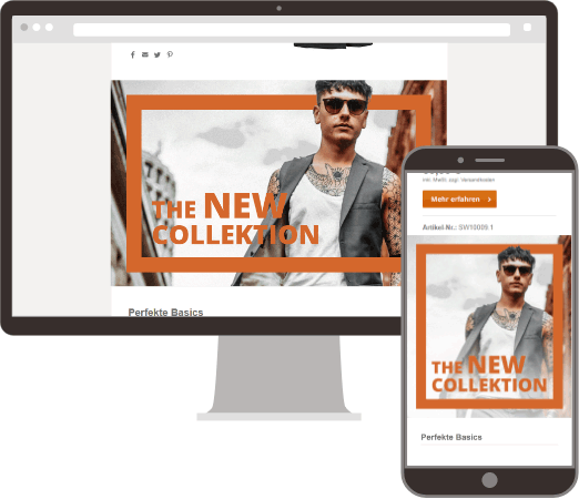
“Incomplete row” means that articles may remain that no longer make a complete row, depending on the number of articles and the article width in the mobile view:
Tip: The quickest way to see what the different mobile display options look like is to simply try out the check boxes in the mobile preview to see what they do.
You can use the "Article (multi-column)" element as a:
-
Main element
-
Footer Element
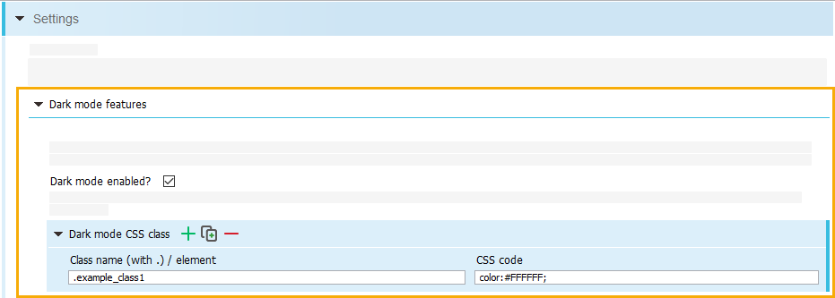
Dark mode features
Element: Dark mode features
Add the "Dark mode features" element to the "Settings" element to enable dark mode and specify any number of CSS classes to control dark mode rendering.
Note: Since there is no uniform functionality of the dark mode on different clients and devices and not all of them support manual corrections, a general functionality cannot be guaranteed.
-
Settings > Dark mode features
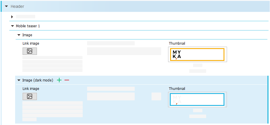
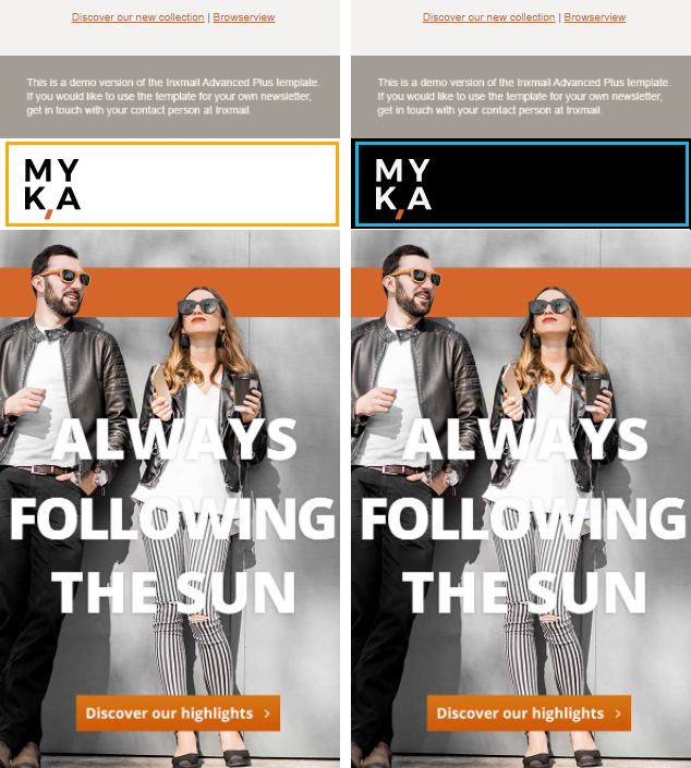
Dark mode graphics
Elements: Alternative dark mode graphics, Image (dark mode)
You can specify alternative dark mode graphics for the elements "Graphics container (mobile)" and "Mobile teaser" (in the "Header").
Note: The dark mode graphic is only display in email clients that support code manipulation. In all other clients, the module's default graphic is also displayed in dark mode.
-
Graphics container (mobile) > Alternative dark mode graphics
-
Header > Mobile Teaser > Image (dark mode)
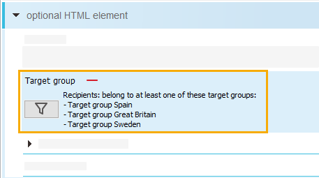
Target group for optional HTML element
Element: Target group
You can add the "Target group" element to the "Optional HTML element". The optional HTML element will then be displayed only for the selected target group, see Adding a target group to a main element.
-
Optional HTML element > Target group
Standard unsubscription page: Apply global color settings optionally
Element: Apply global color settings?
From now on, you can use a checkbox to decide for yourself whether or not global color settings should be applied to the standard unsubscription page.
We recommend that you uncheck the "Apply global color settings?" checkbox if there are display problems with the "Standard unsubscription page" element.
-
Standard unsubscription page > Apply Global Color Settings?
Perform update: Activate the functions by clicking the Update button: 
The following new functions are available in the Advanced Template (Plus) from Version 2020-09:
Article padding
The Content padding > Padding (in px) element allows you to now set the padding (internal spacing) of articles.
You can use the Content padding check box in the following elements of the Advanced Template:
- Settings > Colours, fonts and icons > Content padding > Padding (in px)
- Articles > Article colours > Content padding > Padding (in px)
- Article Header > Article colours > Content padding > Padding (in px)
- Header > Navigation bar Text links > Settings > Padding (in px)
- Footer > Navigation bar Text links > Settings > Padding (in px)
- Articles (two-column) > Article colours > Content padding > Padding (in px)
- Articles (three-column) > Article colours > Content padding > Padding (in px)
- Table of contents > Colours and fonts > Article colours > Content padding > Padding (in px)
- Welcome > Colours and fonts > Article colours > Content padding > Padding (in px)
Article column spacing
The Column spacing input field now allows you to set the column spacing for articles with more than one column.
New element: Section icon
You can use the Section icon element to place an image next to your section headline. The Section icon can be displayed to the left or the right of the headline.
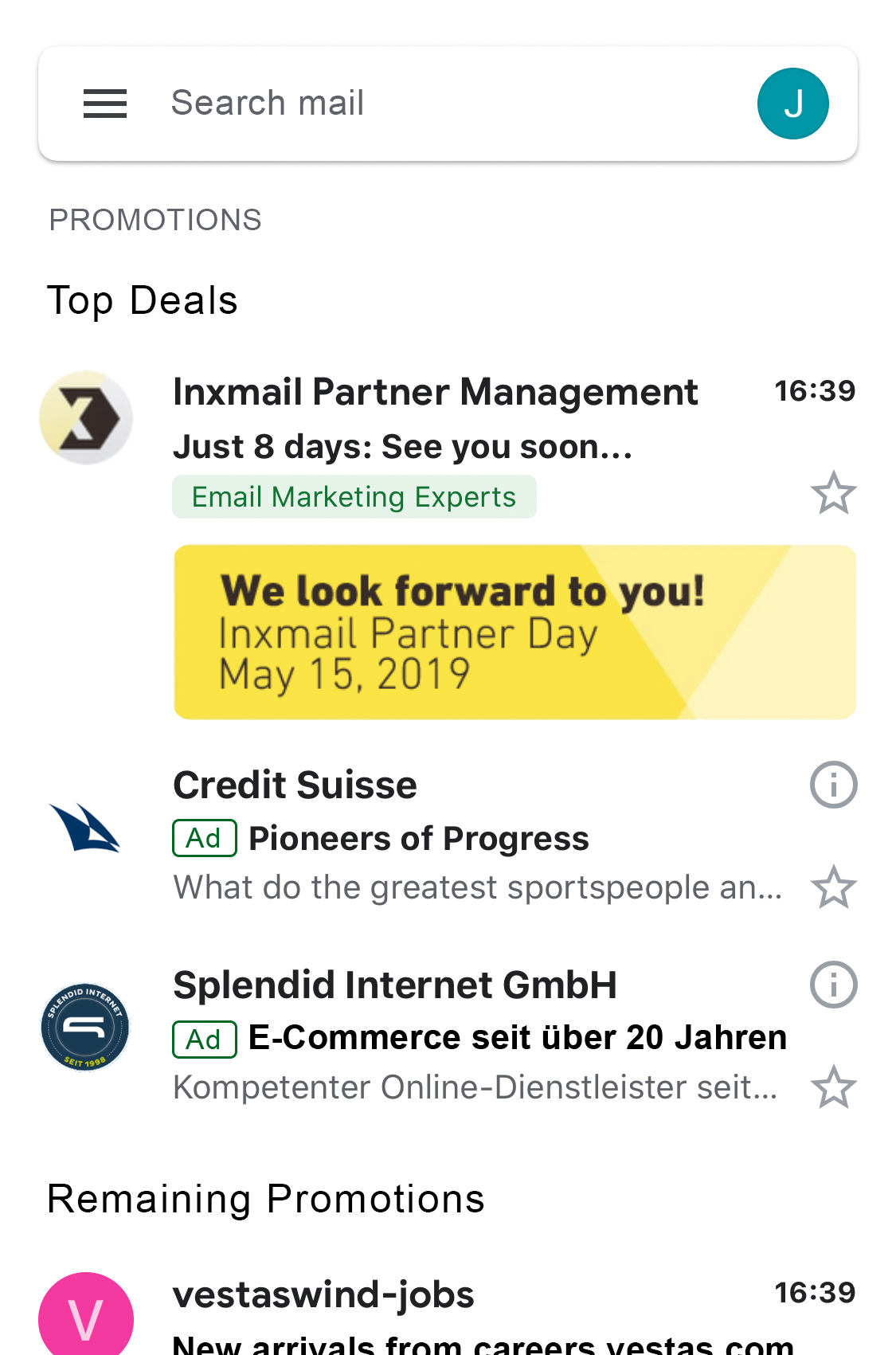
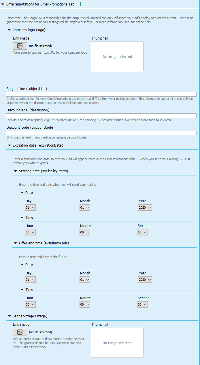
New Element: E-Mail Annotations for Gmail Promotions Tab
Google's Email Annotations help you place your mailings prominently in Gmail's Promotions Tab.
The Advanced Template now offers a simple input mask for using Gmail's Promotions Tab, see: Setting up Email Annotations for Gmail Promotions Tab
New element: Graphics container (mobile)
You can use the new Graphics container (mobile) element to create a graphics container which is only shown on mobile devices.
The settings are the same as in the existing Graphics container module (with the exception of the settings options Hide on mobile devices and Alignment).
Just like the Graphics container element, you can use the Graphics container (mobile) element in the following areas of the Advanced Template:
- Header
- Main elements
- Footer
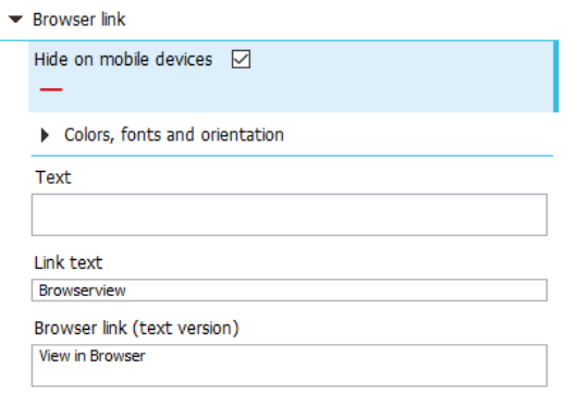
Hide browser link on mobile devices
You can now choose to show or hide the browser link in the mobile view. To do so, use the Hide on mobile devices check box.
New element: Use tracking parameters in the text version
With the Use tracking parameters in the text version check box, you now have the option of also using tracking parameters in the text version of your mailing. The tracking parameters are appended to your links as plain text.
Define target groups for navigation bars
You can now also use the Target group element within the Navigation bar element in order to show a navigation bar only for selected target groups:
- Header > Navigation bar (Text links) > Target group
- Footer > Navigation bar (Text links) > Target group
Further improvements
In addition, we have implemented other new features and enhancements in the Advanced Template.
The following new functions are available in the Advanced Template (Plus) from Version 2019-08:
New elements:
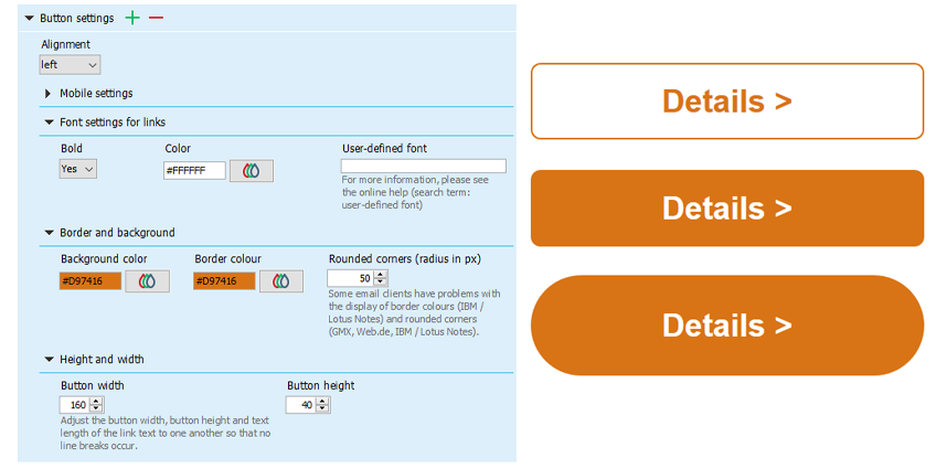
Button and button settings
Settings > Colours, fonts and icons > Button settings
- The new Button element allows you to insert and design a text button.
- The design includes the usual font settings (font, font size, bold, italic, underline, colour), background and border colour and optional rounded corners.
- You can hide the button on mobile, scale to the full width or maintain the defined button measurements.
- The button settings defined at the module or article level always take precedence over specifications in the Settings element.
Create a new mailing to activate the feature.
New element:
HTML head enhancement
Settings > HTML head enhancement
The contents of the HTML head enhancement element are written directly to the HTML in the <head> tag. This may be necessary to integrate the Gmail Promotions Tab, for example.
Use of this element requires prior technical knowledge and is at your own risk, since improper use may have effects on the display of the entire mailing.
Create a new mailing to activate the feature.
Request Gmail Promotions setup now
New element:
Mobile CSS classes enhancement
Settings > Mobile CSS classes enhancement
The Mobile CSS classes enhancement element allows you to define your own CSS classes for mobile display. These classes can be used for graphics or your own HTML code, for example.
Use of this element requires prior technical knowledge and is at your own risk, since improper use may have effects on the display of the entire mailing.
Create a new mailing to activate the feature.
Request customised display in mobile view now
New element:
Article (header)
Header > Article (header)
The Article (header) element is a reduced version of the Article module and offers more design options for the header.
It contains the same subelements and settings as the Article main element, with the exception of the following elements:
- Price
- Button
- Subheadline
Create a new mailing to activate the feature.
New element:
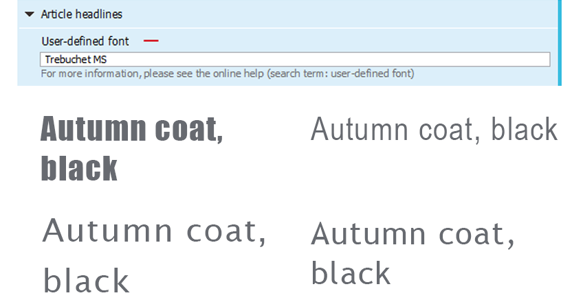
User-defined font
Settings > Colours, fonts and icons > Article headlines > User-defined font
An optional text field to define your own system fonts is available in all elements with font selection.
The font specified here overwrites the fonts in the Font drop-down list of that element.
Ensure that you specify a fallback font when using user-defined fonts, for example in the following form: Frutiger,Arial,sans-serif.
Create a new mailing to activate the feature.
New element:
Article distances
- Header
- Navigation bar
- Image/text element
- Graphics container
- Welcome
- Graphics container
- Section
- Standard article
- Article (two-column)
- Article (three-column)
- Footer
- Navigation bar
- Text (two-column)
- Graphics container
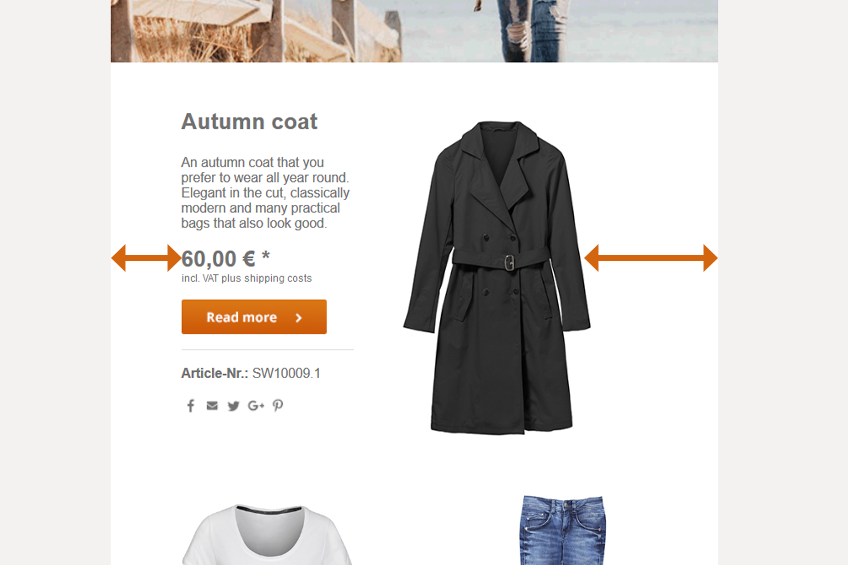
You are now able to specify side margins using the Article distances element.
The side margins defined at the module or article level always take precedence over specifications in the Settings element.
Create a new mailing to activate the feature.
New element:
Dividing line display
Section bar > Horizontal dividing line > Dividing line display
There are now three options to display the horizontal dividing line in the section bars main element:
- Across the entire width
- Respect side margins
- Adjust to text length
If you do not make a selection, the dividing line will be displayed with respect to side margins, as before.
Display multi-column articles side by side in mobile view
- Header > Article (header)
- Standard article
- Article (two-column)
- Article (three-column)
- Footer > Text (two-column)
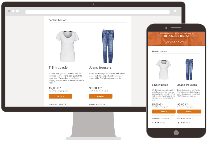
In mobile view, you can now optionally display multi-column elements, such as the Article element, next to one another or above one another.
Create a new mailing to activate the feature.
Browser link in mobile view
The link to the web page view of the mailing is now also shown on mobile clients.
Perform a design update to activate the feature.
Maximum font size increased to 150 px
Settings > Colours, fonts and icons > Article headlines > System fonts
You can now specify all values between 8 and 150 px as the font size.
Create a new mailing to activate the feature.


