In the mobile version, multi-column articles are displayed below one another and not side by side as in the desktop version. Mobile optimised images must therefore have a minimum width of 480 px, so as not to appear pixelated on a smartphone in horizontal format.
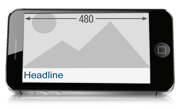
To some degree, the image sizes in the Advanced Template or Comfort Template (for example, widths of 180 px) are below the minimum image width for mobile devices (480 px). The width you use is a matter to consider individually: For faster load times, you might want to use smaller images. An optimum display on mobile devices can be very important or less so, depending on the mailing recipient group. Test both possible variants before you decide on an image size.
Related topics

