Automatic optimisation by the Advanced Template
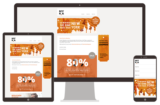
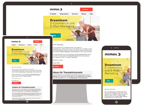
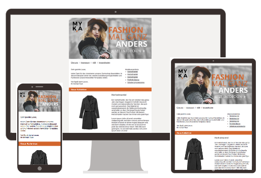
Mailings that you create with the Advanced Template are optimised for all devices. Your newsletters will be displayed optimally on a desktop, tablet or smartphone.
The Advanced Template automatically determines the device on which your newsletter is currently being read. If it is being read on a large desktop screen, for example, images normally appear wider than on a smartphone. Image and text elements of an article are usually displayed side by side on a desktop screen and beneath one another on a smartphone.
The Advanced Template also detects whether the display device is in portrait or landscape format and adjusts the display of the newsletter accordingly.
Examples
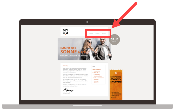
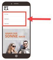
You can set up your mailing so that the operating behaviour also adapts to the device.
Manual configuration of mobile display
The Advanced Template automatically ensures optimum mobile display. However, you also have the option of controlling the mobile display format at various points in the Advanced Template. These settings options are referred to repeatedly in the following sections.
Testing mobile display
The optimum mobile display of newsletters also depends on a number of factors that cannot be directly influenced by the Advanced Template. Consequently, not every mobile device and not every email application can display emails or newsletters correctly.
Due to the numerous different email programs and web clients, we recommend that you test (mobile) display and, if necessary, optimise it for preferred target groups and mobile devices. To test mobile display, you can use mobile preview in the mailing editor in the  Editing workflow step the optional display test in
  Check workflow step. The display test incorporates around 30 popular email programs.
Related topics
