Step by step
To create a three or multi-column article, proceed as follows:
-
Open the Article (three-column) or Article (multi-column) main element in the Template Editor.
Note: The Article (three-column) element is displayed by default with the following elements: Left Article, Middle Article, Right Article.
- You can optionally enter an internal name for the element in the Name field. The chosen name is displayed directly beneath the template element in the structure tree of the Template Editor. It allows you to quickly locate the contents of the newsletter in the structure tree. The name is not visible in the newsletter.
- Select the Hide on mobile devices check box if the three-column article should not be displayed on mobile devices.
-
Then click
 Add element.
The Add new element dialog box is displayed.
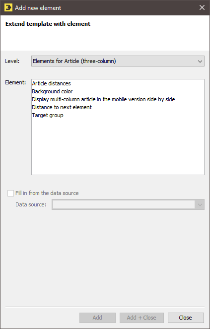
Dialog for “Article (three-column)”
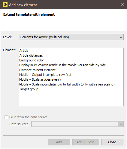
Dialog for “Article (multi-column)”
 Field descriptions for ‘Add new element’ dialog box
Element
Description
Distance to next element
Select the individual distance to the next element level.
Note: If you do not select a distance, the preset distance from the Settings main element is used.
Standard article
For multi-column articles only: Add another sub-article to your multi-column article.
(For three-column articles, the Left article, Middle article, and Right article are inserted automatically).
Article distances
Define the page margins (left and right) and the column spacing.
Background color
Here you can change the background color of the three-column article. To do this, click the
 Select color button.
Note: If you do not select a color, the preset background colors from the main element Settings > Colors, fonts, and icons are applied.
Display multi-column articles side by side in the mobile version
By default, the single articles are displayed beneath one another on mobile devices. Select the Display multi-column articles side by side in the mobile version check box if you want to display the articles side by side. See: Mobile behavior of individual main elements > Article (two-column), Article (three-column), Article (multi-column).
Mobile – Scale articles evenly
Only for multi-column articles: If you use the “Article (multi-column)” element, you can also control the mobile article flow using these settings.
“Incomplete row” means that articles may remain that no longer make a complete row, depending on the number of articles and the article width in the mobile view:
Tip: The quickest way to see what the different mobile display options look like is to simply try out the check boxes in the mobile preview to see what they do.
Mobile – Scale incomplete row to full width (only with even scaling)
Mobile – Display incomplete row first
Mobile – Number of items next to each other (max. 5)
Mobile – Vertical distance between articles
Target group
Select a target group if the three-column article should be displayed only to particular recipients.
- Select the elements from the Element drop-down list if required.
- Confirm the dialog box by clicking Add + Close.
- Then set up the Left Article, Middle Article, Right Article or Article 1 to Article X elements.
-
To do this, click
 Add element after each element.
The Add new element dialog box is displayed.
 Field descriptions for ‘Add new element’ dialog box
Element
Description
Headline
Enter an article heading in the "Heading" field.
Accessibility: If you want screen readers to be able to recognize and correctly read your headings, you must tag them as headings using HTML.
 What do I need headings for? What does h1-h6 mean?
Headings help you structure your content. Different heading levels (h1-h6) ensure different weighting of the content within your mailing and help screen readers, for example, to correctly read your source text. This makes your mailing more accessible (low-barrier).
 How can I tag a heading using HTML?
Put HTML heading tags around your heading text. Depending on the heading level, that is:
- <h1>Heading 1</h1>
- <h2>Heading 2</h2>
- <h3>Heading 3</h3>
- <h4>Heading 4</h4>
- <h5>Heading 5</h5>
- <h6>Heading 6</h6>
Styles
We also recommend that you style your headline using inline css.
Example:
Copy<h1 style="font-size:20px;text-decoration:none;font-weight:bold;color:#0000ff">Überschrift</h1>Explanation: You have formatted your heading in font size 20px, bold, blue and without underline.
Possible for all text fields: You can apply HTML and CSS this way for all text fields. This means that you can structure your content and use different heading levels not only in the “Heading” element, but also in the “Text” element.
Note: If you do not want the headline to be displayed in the table of contents, you can add the Short headline element. The element replaces the headline in the table of contents if the field remains empty.
Image
Link an image, e.g., an image of the product you are offering. You can also add a link.
Accessibility: Insert alternative texts for all your images. This allows recipients with visual impairments to have the text read aloud to them by a screen reader. Bots and search engines also like to access the written image information.
Text
Add a text to the article.
Article width (px)
For multi-column articles only: Enter the width for the current article in pixels.
(The width is scaled automatically for three-column articles.)
Article colours
Select a background colour for the article and the headline. In addition, enable the Content padding check box if space is to be inserted between the article content and the article’s colour border. Add the Padding (in px) element to specify exact values for the padding.
Note: If you use very long words in your mailings, you might need more space than is available. In this case, the Advanced Template ignores the padding. Wrap very long words manually in order to restore the padding.
Fonts for article
In the Fonts for article element, you can select the font formatting options such as the font colour and alignment for headlines and subheadlines, prices, article text and any further links.
Note: You do not align the Price element in the Fonts for article element. Instead, you do this directly within the Price element.
List
Add a numbered list or a list with bullet points.
Buttons: Add a button to your article that takes your readers directly to the product or article you are offering.
You can insert buttons in two different ways:
Button
Insert an HTML button that you can freely edit. Enter the button text and link under "Further link".
You can use the "Button settings" subelement to define the height, width, colour and font, among other settings. See: Configuring settings.
Button as an image
Insert an image and add a link to the image so that it serves as a button.
Accessibility: If you want screen readers to recognize your image button as a button and read it correctly, enter role=“button” in the optional HTML parameters under “Link image to link.”
Short headline
A short headline replaces the headline entry in the table of contents. If neither the headline nor the short headline should be visible in the table of contents, leave the ‘Short headline’ field empty.
Mobile - Allow line break within a word
Select this checkbox to break words at any character in the mobile view. This way you prevent very long words from compromising your layout in mobile view.
Corresponds to the CSS property: word-break: break-all;
Price
Enter all the price information for your offered product.
Alignment
Here you can position the price in the article. Select between left-aligned, right-aligned or centred.
Price
Enter the price of the offered product. You can also specify Text in front of the price or Price information (for example, Only 3 still available).
‘Was’ price
Specify a ‘was’ price if applicable. By default, the ‘was’ price is formatted with the strikethrough font style. You can also specify a Text in front of the ‘was’ price.
Sharing links
Enable the ‘Sharing links’ check box. All created sharing elements are added beneath the article.
Add further links to the article, for example, a link to the company web page.
Subheadline
Enter a subheadline in the Subheadline field.
- Select the desired element.
- Confirm the dialog box by clicking Add + Close.
- Save your entries.
- You have set up a three-column article with the desired elements.
Fill the elements with contents.
Note: Avoid manual HTML formatting for content elements, for example, for a Text element. The optimum client display can enable rendering on different devices, and content may be displayed incorrectly.


