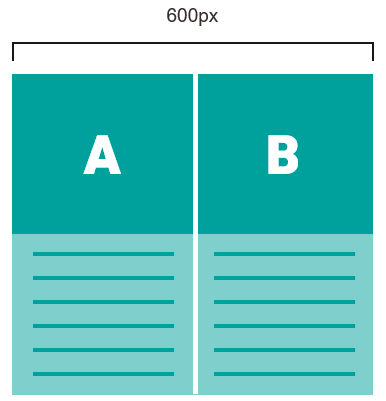
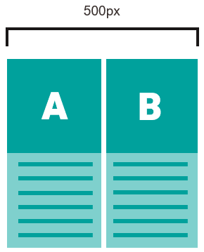
You can hide the main elements Article (two-column), Article (three-column) and Article (multi-column) in the mobile view. In addition, you can specify for these main elements whether the image and text elements should be displayed side by side (scaling) or beneath one another (wrapping) when displayed on a mobile device. Enable the Display multi-column articles side by side in the mobile version check box for scaling display. If necessary, you must add it to the corresponding article first. You will find more detailed explanations of the scaling or wrapping display of articles below.
At the end of the section, you will also find information on the behaviour of image and text buttons in the mobile view.
Scaling versus wrapping display of articles (two-column) and articles (three-column)
Two-column or three-column articles each consist of two or three articles. These each consist of a picture and text element.
Desktop display
In the desktop view, the image and text elements of the individual articles are displayed beneath one another.
Mobile display
For display on mobile devices, you can choose whether the image and text elements should be displayed side by side or beneath one another.
By default, the articles are displayed beneath one another on mobile devices. Select the Display multi-column articles side by side in the mobile version checkbox if you want to display the articles side by side.
Example from an Inxmail newsletter
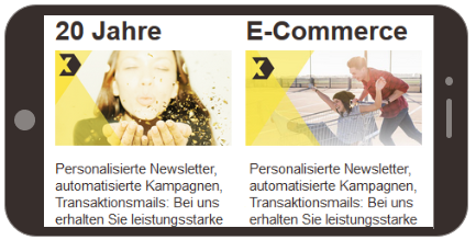
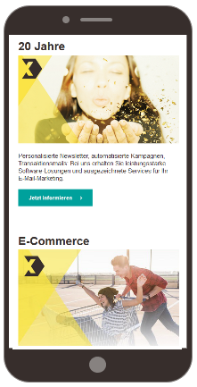
Note: Note that the image appears bigger in the mobile wrapping view than in the desktop view. Mobile optimised images must therefore have a minimum width of 480 px, so as not to appear pixelated in this view.
Font size In the mobile scaling view, only the image is reduced in size. The font size remains the same as in the wrapping view, otherwise the text would be illegible.
If you use the “Article (multi-column)” element, you can also control the article flow using the following settings:
-
Mobile – Scale articles evenly
-
Mobile – Scale incomplete row to full width (only with even scaling)
-
Mobile – Display incomplete row first
-
Mobile – Number of items next to each other (max. 5)
-
Mobile – Vertical distance between articles
“Incomplete row” means that articles may remain that no longer make a complete row, depending on the number of articles and the article width in the mobile view:
Tip: The quickest way to see what the different mobile display options look like is to simply try out the check boxes in the mobile preview to see what they do.
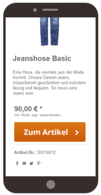
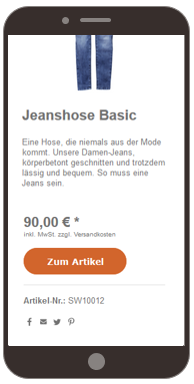
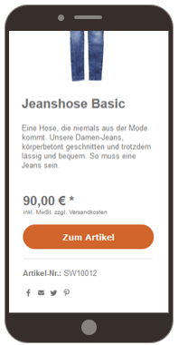
Central graphic elements within articles are the Button as image and Button elements. Both elements allow you to choose whether to occupy (scale) the entire width of the display in the mobile view or to keep it at its original size. If mobile scaling is not set for these items, they will be displayed in the same size in the mobile view as in the desktop view. You can set the respective view using the Do not scale button in the mobile view check box.
In a scaling view of the Button as image element, it may lead to a too large and distorted display of the image.
Not scaling
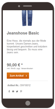
Scaling
With the Button element, the scaling view only leads to an enlarged display, but otherwise has no negative visual effects.
Not scaling
Scaling
You can also exclude the Button element from the mobile view. To do this, select the check box Hide on mobile devices.
Related topics
