Go to the "List reports" navigation item to view your reporting for a specific list.
Step by step
-
Open the
"List reports" navigation item.
-
Select a list and a time frame.
-
Chart reports
In the different tiles, you will see chart reports for the following key figures:
Charts and tables: You can also view all charts as tables by clicking the
list symbol.
Key figure
Facts & tips
Sending report
See the absolute figures of:
-
How many emails (= unique sendings) you have sent out.
-
How many of these emails have been opened.
-
How often they have been clicked.
Subscriptions and unsubscriptions
Too many unsubscriptions? Not enough subscriptions? Check out these tips:
-
Generate more subscriptions
-
Find the reasons for unsubscriptions
Bounces
You will see two bounce charts:
-
Totaled: Shows you all bounces in the selected time frame.
-
Over time: Shows you how your bounces have developed over the selected time frame.
Check out these tips: Understand and avoid bounces
Email provider domains
Find out what are the email providers your recipients mainly use.
Example: Your mailings are mainly read by Gmail and GMX customers? Then focus on this during testing.
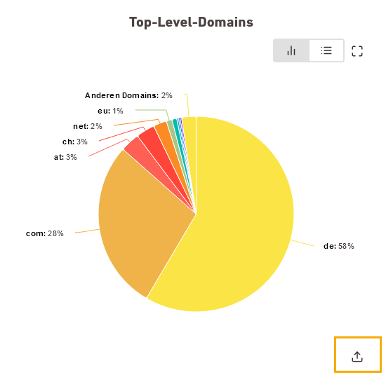
Top level domains
Learn what are the endings of your recipients' email addresses.
Example: If you have many recipients with a specific country ending, it might be a good idea to provide your mailing in another language in the future, or to take regional variations such as currencies and measuring units into account.
Email clients
Do your recipients tend to read mailings in a desktop or in a web client? Or mainly mobile?
Pay special attention to a good mobile design of your mailing and test your mailing specifically with regard to the clients used.
-
-
KPIs (table)
We have summarized the following key figures for you in a table:
-
Sendings
-
Openings
-
Clicks
-
Subscriptions
-
Unsubscriptions
-
Hard bounces
-
Soft bounces
-
Unknown bounces
 What does sum, average value and maximum value mean?
-
Average value: The average value refers to all sendings in the selected time frame.
-
Maximum value: The maximum value is the highest value within your reference time frame.
Example: If you have selected "Daily data" as reference time frame, it is the highest value within a day. If you have selected "Monthly values", the highest value within a month, etc.
-
-
Click the
 share icon in order to export a diagram as an image file, .pdf, .xls or .csv. This way you can send it to colleagues or managers who do not have access to Inxmail.
- You have gained an overview of your list's most important key figures.
Did you not find what you were looking for?
-
Send us your feedback.

