You can hide the Graphics container main element in the mobile view. You can also use the Graphics container (mobile) main element to create a graphics container which is only shown on mobile devices.
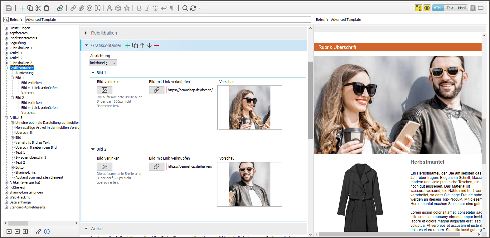
If you use several images in a graphics container, these will be adjusted automatically to match the display size of the device.
Example
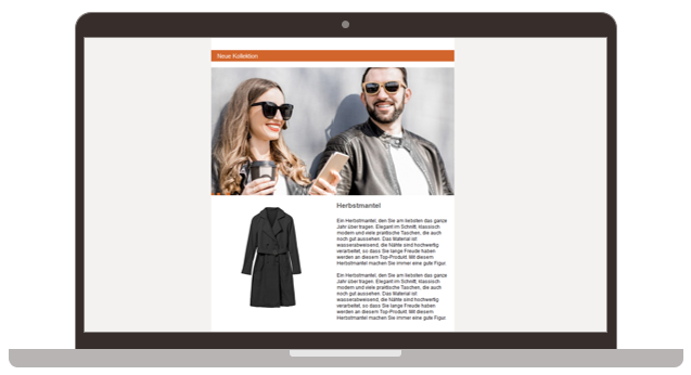
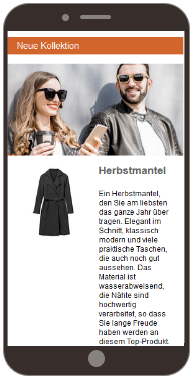
The following example uses two images in a graphics container to create an image map. This means that the individual images are connected using different links.
Desktop display
Mobile display
Mailing editor view
You can use the Alternative dark mode graphics element to store an alternative dark mode graphic for the Graphics container (mobile).
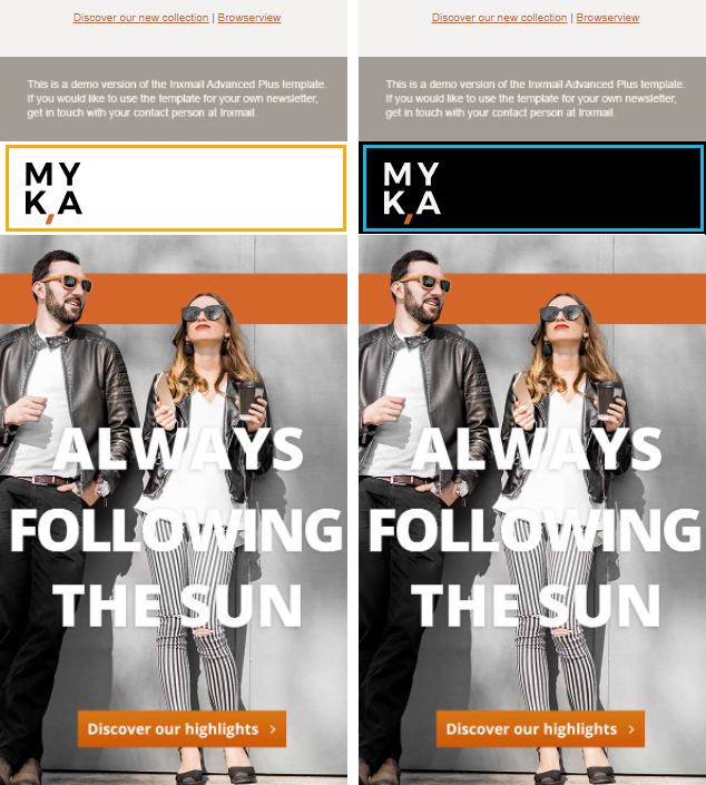
Note: The dark mode graphic is only display in email clients that support code manipulation. In all other clients, the module's default graphic is also displayed in dark mode.
Related topics

