This section is intended for users with in-depth knowledge of CSS (Cascading Style Sheets). (See, for example, the w3schools.com website.)
The Advanced Template allows you to define your own CSS classes for mobile display. This means that in some places you can manually intervene in the default implemented mobile behaviour of the Advanced Template.
Note: Note that using your own CSS classes is at your own risk. Not all email clients are able to interpret CSS classes correctly. This is where they differ from browsers. For this reason, Inxmail can not assume responsibility for any display issues if you use your own CSS classes.
You can use your own CSS classes for displaying images on mobile devices.
Example
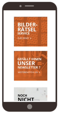
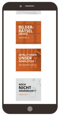
In the mobile view, some images are supposed to occupy only 75 percent of the display width.
Without own CSS class
CSS class ‘width:75%’
Step by step
Proceed as follows to create your own mobile CSS class:
-
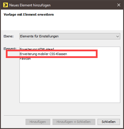
Click the Settings main element.
-
Click
 (Add element).
A dialog box appears.
-
Select the Mobile CSS classes enhancement element.
-
Confirm the dialog box by clicking Add + Close.
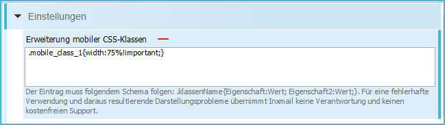
The Mobile CSS classes enhancement element will be displayed.
-
Enter the mobile CSS class in the input field.
The syntax must comply with the following schema:.classname{attribute:value; attribute2:value;}
-
Save your entries.
-
You have created your own mobile CSS class.
Step by step
Proceed as follows to apply your own mobile CSS class to an image:
-
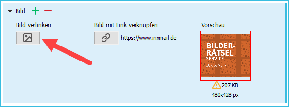
Click the Link image button for the image to which you want to assign a mobile CSS class.
-
The Link image dialog box will be displayed.
-
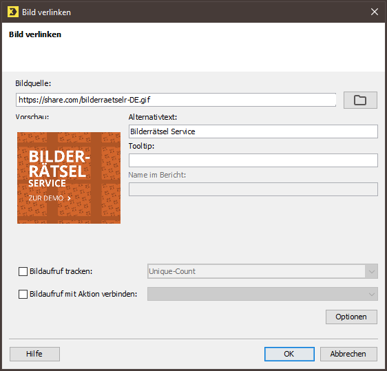
Click Options.
The Options dialog box is displayed.
-
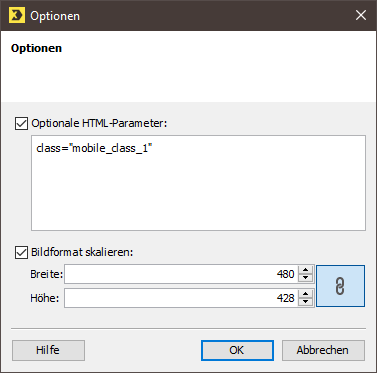
Enter the mobile CSS class under Optional HTML parameters.
-
Confirm the dialog box by clicking OK.
-
Save your entries.
-
You have applied your own mobile CSS class to an image.
Related topics

