Example 5 - Header with graphical navigation bar in desktop and mobile view
In this example, the newsletter contains a graphical navigation bar for both desktop and mobile display. In addition, there is a banner image for both desktop and mobile display.
Mobile display To set up a newsletter with a graphical navigation bar and a banner image for display on a mobile device, you need to add a mobile teaser in the header for each menu item (see above). You will also need to add another mobile teaser by linking the banner image for display on a mobile device.
Desktop display To set up a graphical navigation bar for display on a desktop, you must add a graphics container in the header. Add as many image elements to this graphics container as you need menu items. Add another graphics container for the banner image for display on a desktop. Hide both graphics containers on mobile devices.
Delete the Banner element. If you use optional banner graphic elements, then only delete the Banner graphic element.
Stylised view
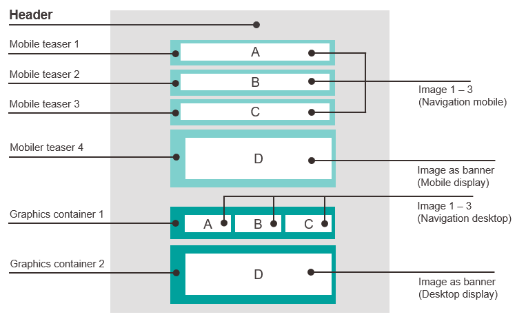
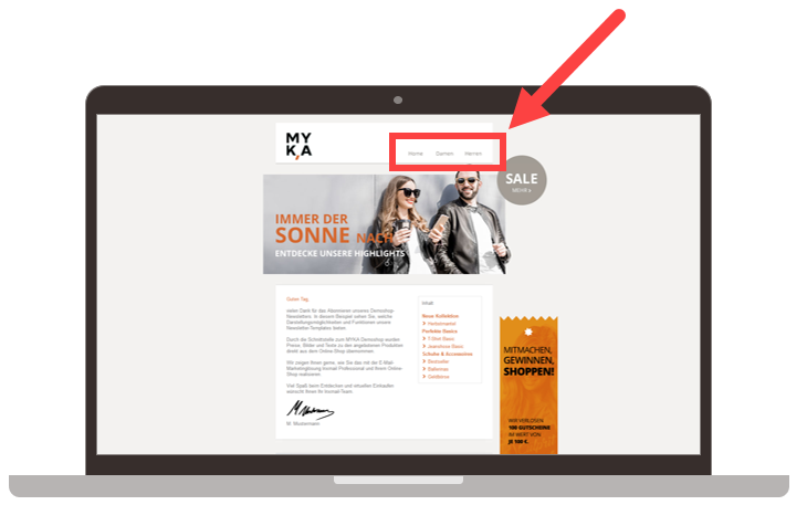
Desktop display
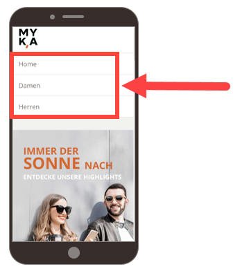
Mobile display
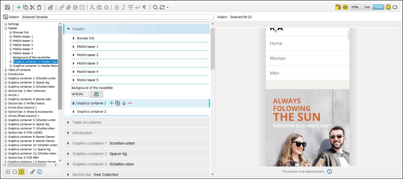
Mailing editor view