Example 4 - Header with graphical navigation bar (mobile)
You can take advantage of mobile teasers to set up a graphical navigation bar for display on mobile devices. In a graphical navigation bar, the individual menu items consist of images which are each associated with a link.
To set up a mobile graphical navigation bar, you need to add a mobile teaser in the header for each menu item. You then need to store an image for each menu item in the respective mobile teasers. Each image should be 600 pixels wide. In the mobile view, it will automatically be scaled to the corresponding display width of the mobile device.
Stylised view
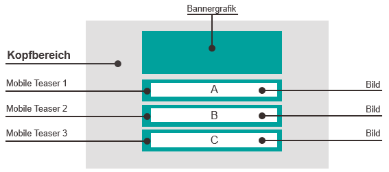
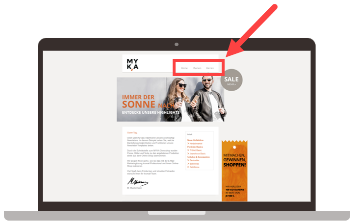
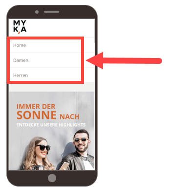
There are three menu items in this example, Home, Women and Men. Images with a width of 600 pixels have been linked in the respective mobile teasers.
Desktop display
Mobile display
Mailing editor view
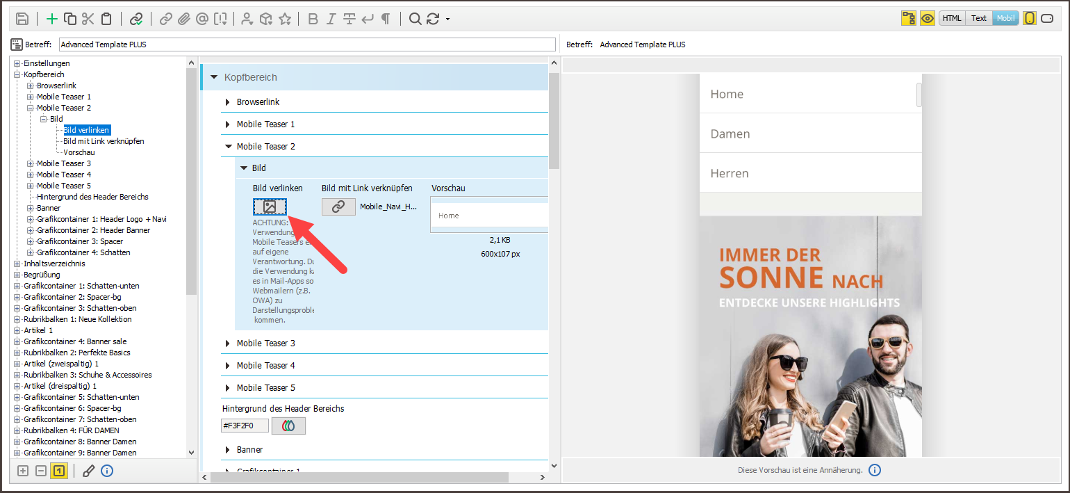
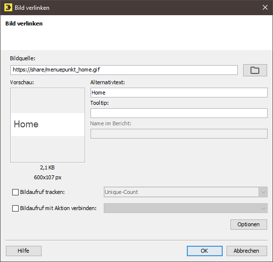
The dialog box for the image with the linked menu item Home is as follows:
Note If you use optional banner graphic elements (left/right) in the Banner element (header), you should always construct the navigation bar using images. Background: The various email clients interpret browser font sizes differently. When using optional banner graphic elements in combination with the navigation bar (text links) element, this will lead to a ‘slipping’ of the optional banner graphic elements.
Related topics

