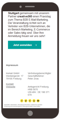
The footer can consist of a whole series of individual elements. These usually include text, which mostly contains the legal notice, unsubscribe link and social media elements. In addition, the Advanced Template offers the option of placing a banner in the footer as well, with banner graphic and optional banner graphic elements to the left and right of the banner graphic. These have a fixed width and extend left and right over the newsletter width of 600 pixels.
Some elements in the footer display mobile behaviour that is permanently implemented by the Advanced Template. For example, the optional banner graphic elements are always hidden in the mobile view. At the same time, you have several options for influencing how the footer is displayed on mobile devices.
For the Text (two-column) element, you can specify whether the two columns should be displayed side by side (scaling) or beneath one another (wrapping) when displayed on a mobile device. You can set the respective view using the Display multi-column version side by side in the mobile version check box.
Text (two-column) side by side
Text (two-column) beneath one another
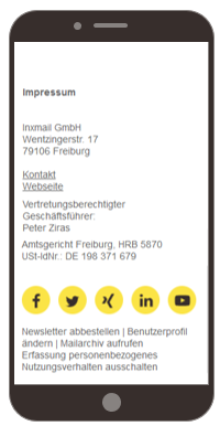
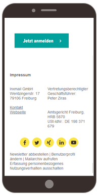
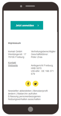
With the Social Media element, you can specify whether the size of the icons should be adapted to the mobile view or whether their size should remain unchanged in the mobile view as well. You can specify the respective display using the Do not scale icons in the mobile version check box. The scaling of icons is useful if you use a large number of social media icons and you want them to extend across the entire width of the display.
Not scaling
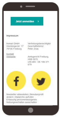
Scaling
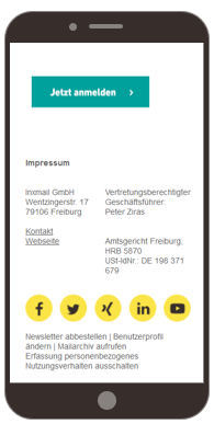
If you use only a few social media icons, a scaling view may lead to a too large and possibly distorted display of the icons.
Not scaling
Scaling
The social media icons in the Footer main element may not be larger than 600 px in total (total width).

